 54
54Sector
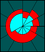
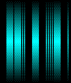
FacesSummary: radial hatching analog time telling Readability: medium Examples: 12:00-11:55 in a loop, 05:05, 06:55, 11:30, 02:40 (default, red PT, gold PTS) Sector is a somewhat minimalistic watchface that plays with angles and shades. You read it like an analog watch, except the hours are told precisely, not gradually. You will encounter differently hatched/shaded areas that tell the time. These areas start at the 12h position and grow clockwise. A 100% dense area is hours and minutes overlapping. Hours are 75% shaded. Minutes are 25% shaded. (75%+25%=100%) So you never see those two shades at the same time. It's either 100% and 75% or 100% and 25%, because it's either the hours or the minutes that leave the overlap. So remember, the 100% area is always the opposite of what left the overlap. This sounds more complicated than it is. 0% is just the background. For watches with black bezels, the background is also black while the drawing colour is white. For watches whith white bezels, the colors are swapped. Design / Programming / Copyright © 2013, 2015 Sam Jerichow
 19
19SGMNTS
FacesSummary: analog segments Readability: medium Examples: 12:59 in various states, 04:36(PTS except gold, PT except red), 06:25 (PTS gold), 08:47(PT red), 12:59 (PTS except gold, PT except red) SGMNTS is an analog watch inspired digital watchface. It's built up from outside to the inside, from bottom layer to top layer, telling the hours, ten-minute-increments and single minutes by segments that are placed at the well known analog watch number positions. The size of the segments varies every time the display refreshes, giving the watchface a different fractured look. The size does NOT matter here, just the amount of segments for the different parts of time. The angle of the final segment is extended to the 360° to fill the display before it gets empty again (going back to 0). The colors look different depending on the color of the Pebble Time round. Please check the example times and the header of this description. Design / Programming / Copyright © 2012, 2015 Sam Jerichow
 584
584Soto X
FacesSummary: minimalistic analog-ish watchface Readability: easy Examples: 03:20 (black PT/S), 04:50 (black PT/S), 05:00 (gold PTS), 10:10 (red PT) Soto X is a minimalistic analog-ish digital watchface. Why ish? The hour hand always shows the exact hour - no guessing here. This might look unusual at times like 10:50, but you'll get used to it. The main design element of this watchface is the frame. It holds the minute hand which extends from it until the center of the display. The hour hand is shorter, has got another colour and is covered by the frame. The colour layout configurable and comes preset differently for the various types of Pebbles. Design / Programming / Copyright © 2015 Sam Jerichow / configuration page by Nev Rawlins / Thanks so much Nev!!
 14
14ION
FacesSummary: symmetric arcs Readability: hard Examples: 12:59, 04:36, 06:25, 08:47 Ok, stick with me guys - this is a tough one. In order to read the time, you have to find the clockwise end of the arcs. Those ends represent a number position in an analog watch display. The inner circle shows the hour, the middle circle shows ten minute increments and the outer circle shows the remaining single minutes. So it's a radial digital 12-5-9 watch. The opposite end of the arcs is just for decoration. The symmetry is making the watchface look (super) cryptic but also gives it a futuristic sci-fi look. When the 12th or 6th hour ought to be shown, or if a minute is 0 or 6, the arc is so small, is becomes a dot. Design / Programming / Copyright © 2014, 2015 Sam Jerichow
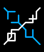
 193
193Xone
FacesSummary: 45° numbers placed in an X Readability: medium Examples: 04:36, 12:59, 18:25, 20:47 The idea was to connect the four time telling numbers to form a single shape. The connection occurs through the corners of the numbers which have been rotated by 45. The resulting shape resembles one X, hence the name Xone. It's not always a single contiuous shape but the exceptions add up to the interesting appearance of this watchface. The numbers are read usuallly top-left, top-right, bottom-left and bottom-right with some head tilting needed maybe and keeping the overlap in mind, that creates a slight crypticness. Design / Programming / Copyright © 2015 Sam Jerichow
 68
68Sanctus
FacesSummary: lines that reveal themselves as numbers Readability: medium Examples: 08:36, 12:59, 14:25, 20:47 The watchface Sanctus is made of lines that look cryptic at first but reveal themselves to be lit parts of normal numbers. There are the expected four numbers but they are black on black background. To make them visible, each of them has two sides lit up by an imaginative lightsource in the very center of the watchface. Normally one expects all four numbers to be lit the same way - and that would make them easier to read - but placing the light source in the middle, creates a nice little artwork that at certain times resembles a cross. That's why I gave it the name Sanctus. Design / Programming / Copyright © 2015 Sam Jerichow
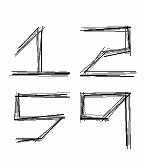 549
549Sketch
FacesSummary: sketchy numbers Readability: easy I was sketching for some nice numbers and thought, I could use this little imperfection for a watchface. The four numbers of Sketch never look the same, just as if you redraw the same thing again and again but never exactly like before. I tried a look between pencil and coal and kept it black on white. Possible future customization not excluded... Hope you enjoy! Design / Programming / Copyright © 2015 Sam Jerichow
 189
189Kurōma
FacesSummary: pixels, squares, right angles! Readability: easy Examples: 04:36, 12:59, 18:25, 20:47 Kurōma (クローマ) is the japanized version of the word Chroma which is another watchface this one is related to. This time there are no differently sized circles but squares, making the whole display look more techy. This watchface is for arts lovers, design fans and square addicts. Redesign / Programming / Copyright © 2015 Sam Jerichow
 54
54Nexus
FacesSummary: glyphy X shape Readability: medium Examples: 04:36 (all PT except red, all PTS except gold), 12:59 (gold PTS), 18:25 (all PT except red, all PTS except gold), 20:47 (red PT) The numbers of Nexus are based on two overlapping squares. Please check the number overview in the preview section! The two hour numbers as well as the two minute numbers themselves are connected and build a longer glyph tha appears cryptic at the first glance. Both glyphs are placed crossing each other, forming an X, that inspired the name. The red Pebble Time and the golden Pebble Time Steel have different number colours. Please check the top of this description. Design / Programming / Copyright © 2015 Sam Jerichow
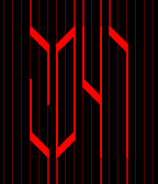 30
30LNG
FacesSummary: cryptic 45° lines Readability: medium Examples: 04:36, 12:34, 12:59, 20:47 The numbers of LNG are made of lines, that come from outside the display and leave it when the job is done. Whenever necessary, these lines sharply bend about 45° to form a more or less abstract number. The abstraction gives the whole display a cryptic sci-fi look. It takes a bit to get used to the numbers, but that's the deal ;) Design / Programming / Copyright © 2015 Sam Jerichow
 95
95Sharp
FacesSummary: sharp, futuristic numbers Readability: easy Examples: 04:36, 12:59, 18:25, 20:47 Sharp's numbers are all based on a checkbox with an x in it (☒). That alone wasn't satisfying so I sketched around and came up with the futuristic style you see now. Design / Programming / Copyright © 2015 Sam Jerichow
 216
216Horologicode
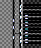
FacesSummary: a readable barcode Readability: medium Examples: 04:36, 06:25, 08:47PM, 12:59PM I was experimenting with a barcode time that's actually readable. I kept it a little cryptic, which is the essential aesthetic of a barcode, next to the minimalistic style. I also decided to leave numbers away, that would have degraded the code to mere decoration. But you don't need numbers. All you need to know is that the thin bar │ is a 1 and the thick bar █ is a 5. So the thin bars count up to 4 and the thick bars up to 2, which is a 10. So a 6 for example is a thick and a thin bar. There are four sections, that are divided by a thick gap to minimize confusion, while in each section the bars are separated by thin gaps to keep a visual relationship. Left you have the hours, in the middle are 10 minute increments and on the right are the remaining minutes. On the far right is the PM indicator for relevant times. The Pebble Time version has a gradient, giving the whole code a smoother appearance. It's not only looking cool but also goes better with the round case. Design : Sam Jerichow Programming : Sam Jerichow Copyright © 2012, 2015 Sam Jerichow
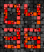
 232
232Chroma
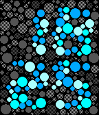
FacesSummary: dots, dots, dooots Readability: easy Examples: 04:36, 12:59, 18:25, 20:47 Chroma is inspired by colour blind test patterns invented by Dr. Shinobu Ishihara in 1917. Those are made of many dots of which some important ones are in a different color. For non colour blind people those tests are solvable but not always at first glance. Chroma achieves a higher contrast by using gray shades for the background dots and blue shades for the number dots. This watchface is for arts lovers, design fans and dot fetishists. Redesign / Programming / Copyright © 2015 Sam Jerichow
 34
34Capacitor R
FacesSummary: two cryptic segmented columns Readability: impossible at first, medium after training Examples: 04:36, 12:59, 18:25, 20:47 I played once more with digits that got stolen the center segments and thought about emphasizing the void on the "hardware" level of the watch face design. This is how the two columns of lights were made. Please check the number explanation in the preview section! At first those light columns are seen as single information units but the way to read the watch is across the center gap which nobody will know when you show them the display. I let the lights seem to originate from the lateral display edges, getting stronger on the and then suddenly stop. This bilateral design reminded me of a capacitor, and so the name was born. The Capacitor watch face is for fans of science fiction as well as science fact. Design / Programming / Copyright © 2014, 2015 Sam Jerichow
 39
39IIE
FacesSummary: normal numbers... but split Readability: medium Examples: 04:36, 12:59, 18:25, 20:47 I was sketching for a simple way to deform the classic seven-segment-LED-digits and came up with the idea to just let the horizontal segments take a step aside. The result is a confusing bunch of lines. To celebrate this confusion, I emphasized the horizontal and vertial lines with according geometry, pretending, the segments are meant to be there. This is a watchface for people who like edges and segments, angles and gaps and a confusing but cool looking display that isn't too hard to be learned. Design / Programming / Copyright © 2012, 2015 Sam Jerichow
 10
10Eco Cycle W
FacesSummary: stylish veggie numbers Readability: medium Examples: 04:36, 12:34, 12:59, 20:47 Eco is a watchface about creation, growth, aging, death and recreation. The numbers represent a growing leaf or a fruit. The bigger the digit value, the bigger the digit size. In the end, the lifeform dies and makes place for a new one. As in real life, it's all about regeneration and diversity. The watchface looks different throughout the day and you will find interesting combinations. Eco Cycle has coloured numbers. It starts with a deep green, turing yellow, going over red to brown and ending in a dead gray before the new number gets born. The original Pebble gets a minimalistic black and white watchface, worthy a separate mention for it's graphical style. Design / Programming / Copyright © 2015 Sam Jerichow
 17
17Eco Style
FacesSummary: stylish veggie numbers Readability: medium Examples: 04:36, 12:34, 12:59, 20:47 Eco is a watchface about creation, growth, aging, death and recreation. The numbers represent a growing leaf or a fruit. The bigger the digit value, the bigger the digit size. In the end, the lifeform dies and makes place for a new one. As in real life, it's all about regeneration and diversity. The watchface looks different throughout the day and you will find interesting combinations. Eco Style is shaded in a fresh green, focusing on the herbal inspiration and staying reduced. The original Pebble gets a minimalistic black and white watchface, worthy a separate mention for it's graphical style. Design / Programming / Copyright © 2015 Sam Jerichow
 23
23Eco Cycle B
FacesSummary: stylish veggie numbers Readability: medium Examples: 04:36, 12:34, 12:59, 20:47 Eco is a watchface about creation, growth, aging, death and recreation. The numbers represent a growing leaf or a fruit. The bigger the digit value, the bigger the digit size. In the end, the lifeform dies and makes place for a new one. As in real life, it's all about regeneration and diversity. The watchface looks different throughout the day and you will find interesting combinations. Eco Cycle has coloured numbers. It starts with a deep green, turing yellow, going over red to brown and ending in a dead gray before the new number gets born. The original Pebble gets a minimalistic black and white watchface, worthy a separate mention for it's graphical style. Design / Programming / Copyright © 2015 Sam Jerichow
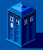 428
428Tardis
FacesSummary: time telling TARDIS Readability: easy Examples: 04:36, 12:59, 18:25, 20:47 This is a watchface for fans of Doctor Who. I think I don't have to explain the TARDIS, right? I was playing around with some sizes and views and found the isometric view the coolest. Time telling occurs through the door windows. They change throughout the series, so this little adaption shouldn't be a sacrilege. I drew every pixel by myself, trying to achieve the best outcome for the Pebble Time. You can even read "POLICE BOX" if you look super close. This watchface also works for original Pebble but looks really good in color. This is a non-commercial use of the blue police box trademarked by the BBC. This is my own interpretation. Pixeldesign / Programming / Copyright © 2015 Sam Jerichow Big thanks to Nev Rawlins who helped me making this become reality.
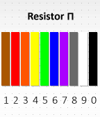 10
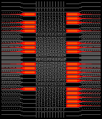
10Resistor Pi
FacesSummary: Color bars instead of numbers. Readability: easy Examples: 04:36, 12:59, 18:25, 20:47 This is a minimalistic style version of the Resistor watchface. The Pi version has numbers below to help you read the time and actually to train you to read the other Resistor versions. Resistor is a fun watchface with a scientific background. It is a derivation of my Spectrum watchface but this time it's based on the resistor color code. So electricians and DIYers might know the colors already while others just see wrist decoration. Check out the color reference chart in the preview section! Design / Programming / Copyright © 2015 Sam Jerichow Special thanks to Tyler Bules who had the idea to use resistor colours.