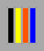
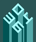
 1
1Resistor Gamma
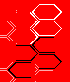
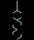
FacesSummary: Color bars instead of numbers. Readability: hard, easy if you know Examples: 04:36, 12:59, 18:25, 20:47 This is a minimalistic style version of the Resistor watchface. Check out the Pi version with numbers! Resistor is a fun watchface with a scientific background. It is a derivation of my Spectrum watchface but this time it's based on the resistor color code. So electricians and DIYers might know the colors already while others just see wrist decoration. Check out the color reference chart in the preview section! Design / Programming / Copyright © 2015 Sam Jerichow Special thanks to Tyler Bules who had the idea to use resistor colours.
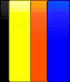 15
15Resistor
FacesSummary: Color bars instead of numbers. Readability: hard, easy if you know Examples: 04:36, 12:59, 18:25, 20:47 Resistor is a fun watchface with a scientific background. It is a derivation of my Spectrum watchface but this time it's based on the resistor color code. So electricians and DIYers might know the colors already while others just see wrist decoration. Check out the color reference chart in the preview section! Design / Programming / Copyright © 2015 Sam Jerichow Special thanks to Tyler Bules who had the idea to use resistor colours because they are already stuck in his head.
 39
39Up R
FacesSummary: minimalistic block number isometry Readability: medium Examples: 04:36, 12:59, 18:25, 20:47 This watchface is made of blocky numbers built up from the depth of your wrist. They are presented in an isometry view. There are only two shades that shape the numbers. The appareance is rather 2D but once your eyes adapted, you see the 3D numbers. If you like minimalism, 2D graphics and blocks, Up might be for you. The red version was made especially for the red Pebble Time. Design : Sam Jerichow Programming : Sam Jerichow Copyright © 2013, 2015 Sam Jerichow
 13
13Up C
FacesSummary: minimalistic block number isometry Readability: medium Examples: 04:36, 12:59, 18:25, 20:47 This watchface is made of blocky numbers built up from the depth of your wrist. They are presented in an isometry view. There are only two shades that shape the numbers. The appareance is rather 2D but once your eyes adapted, you see the 3D numbers. If you like minimalism, 2D graphics and blocks, Up might be for you. Design : Sam Jerichow Programming : Sam Jerichow Copyright © 2013, 2015 Sam Jerichow
 7
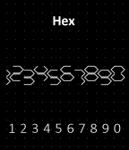
7Hex S
FacesSummary: Double hexagon numbers Readability: medium Examples: 04:36, 12:59, 18:25, 20:47 The time is told in 4 digital numbers, that are created each by two separate hexagons. This separation adds a little crypticness, if you see each hexagon as a unit. Once you passed the barrier of abstraction, it's easy. Design / Programming / Copyright © 2011, 2015 Sam Jerichow
 18
18Hex Z
FacesSummary: Double hexagon numbers Readability: medium Examples: 04:36, 12:59, 18:25, 20:47 The time is told in 4 digital numbers, that are created each by two separate hexagons. This separation adds a little crypticness, if you see each hexagon as a unit. Once you passed the barrier of abstraction, it's easy. Design / Programming / Copyright © 2011, 2015 Sam Jerichow
 22
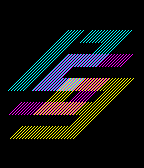
22Skew Spirit CMY
FacesSummary: big, skewed numbers. Readability: easy Examples: 04:36, 06:25, 08:47, 12:59 The Skew watchface series consists of the types Stream, Super and Spirit. In Stream the skewed numbers are connected at their corners and have a single color. They create a single, interesting looking shape that has to be read top to bottom. In Super the numbers have different colours and the overlapping parallelogram shows the combination colour - a little design tweak for colour fans. In Spirit the differently coloured numbers moved closer and overlap more. So there are more combination colour areas that leave a maybe hard to read but not unreadyble display. May the spirits help you reading that little piece of art. Design : Sam Jerichow Programming : Sam Jerichow Copyright © 2015 Sam Jerichow
 88
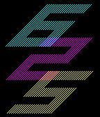
88Skew Super CMY
FacesSummary: big, skewed numbers. Readability: easy Examples: 04:36, 06:25, 08:47, 12:59 The Skew watchface series consists of the types Stream, Super and Spirit. In Stream the skewed numbers are connected at their corners and have a single color. They create a single, interesting looking shape that has to be read top to bottom. In Super the numbers have different colours and the overlapping parallelogram shows the combination colour - a little design tweak for colour fans. In Spirit the differently coloured numbers moved closer and overlap more. So there are more combination colour areas that leave a maybe hard to read but not unreadyble display. May the spirits help you reading that little piece of art. Design : Sam Jerichow Programming : Sam Jerichow Copyright © 2015 Sam Jerichow
 10
10Skew Stream C
FacesSummary: big, skewed numbers. Readability: easy Examples: 04:36, 06:25, 08:47, 12:59 The Skew watchface series consists of the types Stream, Super and Spirit. In Stream the skewed numbers are connected at their corners and have a single color. They create a single, interesting looking shape that has to be read top to bottom. In Super the numbers have different colours and the overlapping parallelogram shows the combination colour - a little design tweak for colour fans. In Spirit the differently coloured numbers moved closer and overlap more. So there are more combination colour areas that leave a maybe hard to read but not unreadyble display. May the spirits help you reading that little piece of art. Design : Sam Jerichow Programming : Sam Jerichow Copyright © 2015 Sam Jerichow
 11
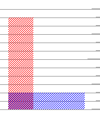
11Overlay RGB
FacesSummary: rectangles. yes exactly. Readability: hard Examples: 02:46, 09:31, 11:02, 12:59 Overlay is a watchface made of three rectangles that tell the hours, ten minute increments and single minutes by their height. There are helping lines in the background and a scale on the right side. Each third marker is longer and the sixth one is even a bit longer. I avoided numbers on purpose to keep the abstract appearance of the display. The width of the rectangles defines how to read: the wider, the later. That's basically "left to right", how you normally read. The rectangles are transparent so they create new rectangles in the mutual overlay area and therefore a new little scientific looking artwork as time passes. Design / Programming / Copyright © 2011, 2012, 2015 Sam Jerichow Thank you Nev Rawlins for your help!
 12
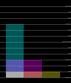
12Overlay CMY
FacesSummary: rectangles. yes exactly. Readability: hard Examples: 02:46, 09:31, 11:02, 12:59 Overlay is a watchface made of three rectangles that tell the hours, ten minute increments and single minutes by their height. There are helping lines in the background and a scale on the right side. Each third marker is longer and the sixth one is even a bit longer. I avoided numbers on purpose to keep the abstract appearance of the display. The width of the rectangles defines how to read: the wider, the later. That's basically "left to right", how you normally read. The rectangles are transparent so they create new rectangles in the mutual overlay area and therefore a new little scientific looking artwork as time passes. Design / Programming / Copyright © 2011, 2012, 2015 Sam Jerichow Thank you Nev Rawlins for your help!
 128
128Elevation R
FacesSummary: block number isometry Readability: easy Examples: 04:36, 12:59, 18:25, 20:47 This watchface is made of blocky numbers built up from the depth of your wrist. They are presented in an isometry view. with different shades to achieve a slight a 3D effect. If you like minimalism and blocks, come grab Elevation! Design / Programming / Copyright © 2012, 2015 Sam Jerichow
 69
69Elevation C
FacesSummary: block number isometry Readability: easy Examples: 04:36, 12:59, 18:25, 20:47 This watchface is made of blocky numbers built up from the depth of your wrist. They are presented in an isometry view. with different shades to achieve a slight a 3D effect. If you like minimalism and blocks, come grab Elevation! Design / Programming / Copyright © 2012, 2015 Sam Jerichow
 33
33Origami
FacesSummary: Folded sheet of paper? Yes! Readability: medium Examples: 04:36, 12:59, 18:25, 20:47 I spent some time with origami and I like the idea of creating different things with one sheet of paper. In origami you normally use square paper and for a nice effect the backside can have another color that comes to view here and there. I am using this effect to show the numbers. Since origami does not allow ripping or cutting the paper, the resulting numbers are pretty abstract, but always resemble their originals. You have to pay attention to the revealed brighter backside of the paper. The number 8 is an exception. Still, the paper has to stay intact. So I just folded the diagonals that represent the junction in 8's center. This watchface is for fans of origami and those who like some arts on their wrist. Design / Programming / Copyright © 2012, 2015 Sam Jerichow
 24
24Pixel Intensity C
FacesSummary: Very low resolution numbers Readability: medium Examples: 04:36, 12:59, 18:25, 20:47 Warning: It's the same as the M version for original Pebbles. I like pixels so I developped a display, that shows time with low resolution numbers. Imagine the classic 7-segment numbers you know from LCD displays. In this watchface, they are pixelated to the max, until they are almost unrecognizeable. Almost. The result is a set of numbers made of 2x3 pixels which are still distinguishable by the position and the brightness of their pixels. The rule is: the more lines are in that area, the stronger the pixel. Low resolution doesn't mean low quality. There are pixels everywhere these days. It's a cool artistic way to describe reality. Design / Programming / Copyright © 2012, 2015 Sam Jerichow Again, thanks to Nev Rawlins for his support!
 526
526Neon IO X
FacesSummary: Neon tubes ftw. Readability: medium Examples: 04:36, 12:59, 18:25, 20:47 Neon IO uses an inside-out array for the four digits instead of a 2x2 one. So you have to read the small inner number first and the move outwards digit by digit. The most numbers are recognized intuitively - they look like the well known 7-segment digits without the center segment. For the 8 another encryption had to be found, to distinguish it from the 0. The = symbol it is. If it helps, it's like the 8 but just using the two voids (:) that have been stretched (=). The display of the Neon IO looks way more cryptic than the one from Neon. It takes a bit longer to understand it, but the dense mazy style looks cool. Design / Programming / Copyright © 2012, 2015 Sam Jerichow
 171
171Neon X
FacesSummary: Neon tubes ftw. Readability: medium Examples: 04:36, 12:59, 18:25, 20:47 I always liked neon tube displays in sci-fi movies. Back then, when CGI wasn't used for every little thing, I liked the fact, soemone actually built alien symbols of neon tubes, that really work. I was sketching for minimalistic, square based numbers that make a cool neon tube display. The most numbers are recognized intuitively - they look like the well known 7-segment digits without the center segment. For the 8 another encryption had to be found, to distinguish it from the 0. The = symbol it is. If it helps, it's like the 8 but just using the two voids (:) that have been stretched (=). I like this symbol here, because it goes well with the alien touch of the display. Whenever the 8 appears, the whole display apperas to be even more cryptic, as it actually is. Design / Programming / Copyright © 2012, 2015 Sam Jerichow
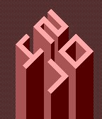
 31
31XtalV
FacesSummary: Hexagon based numbers for alien display Readability: medium Examples: 04:13, 07:36, 10:18, 18:25 XtalV is watchface that uses hexagon based numbers with some lines taken away. I arranged these symbols vertically which makes the display look cryptic, like an alien inscription. Once you know the numbers, the display is easy to read while it keeps its alien look throughout the day. XtalV is for minimalists, hexagon lovers and those with alien ancestors ;) Design / Programming / Copyright © 2012, 2015 Sam Jerichow
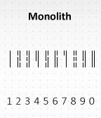 19
19Monolith Dual R
FacesSummary: Minimalistic bars as numbers Readability: medium Examples: 04:36, 12:59, 18:25, 20:47 The red version was made for the Red Pebble Time. The Monolith display idea started with sketching for minimalistic numbers. I made these slim blocks with different lengths that form numbers in a new way. They look a bit like a barcode or some skyscraper lights. There are no horizontal elements but these numbers work just fine. Monolith is clean, solid, minimalistic, geeky and cool. Design / Programming / Copyright © 2012, 2015 Sam Jerichow
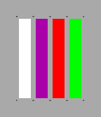 3
3Spectrum Gamma
FacesSummary: Color bars instead of numbers. Readability: hard Examples: 04:36, 12:59, 18:25, 20:47 This is another version of my original Spectrum. Gotta love those bars :) Check out the Pi version with numbers! Spectrum is a fun watchface with a scientific background. It started as binary idea. 1 = white and 0 = black. Once I had the basic shades for the basic numbers I thought, it would be interesting to give all the other numbers parts of the color spectrum. The cool thing is, the color spectrum can be divided into 8 distinguishable colors indeed! I'm using four long bars to tell the time. This is inspired by emission spectra of elements that get passed by light. The width of the bars increases by the usage of that digit. So basically, each number is a color. Sounds simple, but how do you learn which color belongs to which number? Make up a story. Red is love of two people. Orange three sounds like orange tree etc. The sillier the story, the easier to memorize. After a while you can read the watch faster while others just see wrist decoration. I recommend the color reference chart in the preview section. Good luck! Design / Programming / Copyright © 2012, 2015 Sam Jerichow