 6
6Spectrum Pi
FacesSummary: Color bars instead of numbers. Readability: easy Examples: 04:36, 12:59, 18:25, 20:47 This is another version of my original Spectrum. Gotta love those bars :) The Pi version has numbers below to help you read the time and actually to train you to read the other Spectrum versions. Spectrum is a fun watchface with a scientific background. It started as binary idea. 1 = white and 0 = black. Once I had the basic shades for the basic numbers I thought, it would be interesting to give all the other numbers parts of the color spectrum. The cool thing is, the color spectrum can be divided into 8 distinguishable colors indeed! I'm using four long bars to tell the time. This is inspired by emission spectra of elements that get passed by light. The width of the bars increases by the usage of that digit. So basically, each number is a color. Sounds simple, but how do you learn which color belongs to which number? Make up a story. Red is love of two people. Orange three sounds like orange tree etc. The sillier the story, the easier to memorize. After a while you can read the watch faster while others just see wrist decoration. Check out the color reference chart in the preview section and... enjoy! Design / Programming / Copyright © 2012, 2015 Sam Jerichow
 6
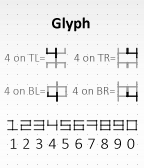
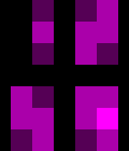
6Glyph TR G
FacesSummary: Mirrored digits look complicated but aren't. Readability: medium Examples: 04:36, 12:59, 18:25, 20:47 I mirrored the four classical digits twice, once horizontally and then once vertically. The resulting digits are point symmetric and look like glyphs from an unknown language. Sometimes they resemble Chinese. There are actually four ways to mirror the digits that result in symmetric digits. The reading rule is: concentrate on one of the 4 corners of each glyph depending on the watchface name. TL means top left, TR means top right, BL means bottom left and BR means bottom right. There you will find the well known number within the glyph. Once you know the trick, it's actually pretty easy. Design / Programming / Copyright © 2012, 2015 Sam Jerichow
 8
8Glyph TL Y
FacesSummary: Mirrored digits look complicated but aren't. Readability: medium Examples: 04:36, 12:59, 18:25, 20:47 I mirrored the four classical digits twice, once horizontally and then once vertically. The resulting digits are point symmetric and look like glyphs from an unknown language. Sometimes they resemble Chinese. There are actually four ways to mirror the digits that result in symmetric digits. The reading rule is: concentrate on one of the 4 corners of each glyph depending on the watchface name. TL means top left, TR means top right, BL means bottom left and BR means bottom right. There you will find the well known number within the glyph. Once you know the trick, it's actually pretty easy. Design / Programming / Copyright © 2012, 2015 Sam Jerichow
 8
8Glyph BR R
FacesSummary: Mirrored digits look complicated but aren't. Readability: medium Examples: 04:36, 12:59, 18:25, 20:47 I mirrored the four classical digits twice, once horizontally and then once vertically. The resulting digits are point symmetric and look like glyphs from an unknown language. Sometimes they resemble Chinese. There are actually four ways to mirror the digits that result in symmetric digits. The reading rule is: concentrate on one of the 4 corners of each glyph depending on the watchface name. TL means top left, TR means top right, BL means bottom left and BR means bottom right. There you will find the well known number within the glyph. Once you know the trick, it's actually pretty easy. Design / Programming / Copyright © 2012, 2015 Sam Jerichow
 34
34Glyph BL B
FacesSummary: Mirrored digits look complicated but aren't. Readability: medium Examples: 04:36, 12:59, 18:25, 20:47 I mirrored the four classical digits twice, once horizontally and then once vertically. The resulting digits are point symmetric and look like glyphs from an unknown language. Sometimes they resemble Chinese. There are actually four ways to mirror the digits that result in symmetric digits. The reading rule is: concentrate on one of the 4 corners of each glyph depending on the watchface name. TL means top left, TR means top right, BL means bottom left and BR means bottom right. There you will find the well known number within the glyph. Once you know the trick, it's actually pretty easy. Design / Programming / Copyright © 2012, 2015 Sam Jerichow
 78
78Scriptum O
FacesSummary: Continuous 45° pattern forms numbers Readability: easy Examples: 04:36, 12:59, 18:25, 20:47 The middle area shows the numbers that mirror out above and below to create a continuous pattern for artistic reasons. 45° style ftw! Design / Programming / Copyright © 2012, 2015 Sam Jerichow Hi Nev, I made this on my own!
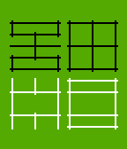
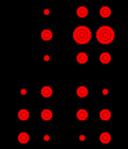 29
29Digital Density R
FacesSummary: Time telling dots! Readability: medium Examples: 04:36, 12:59, 18:25, 20:47 I was sketching for a stylish way to transform the classic 7-segment numbers. One day I thought about how these numbers would look, if seen through a perforated metal plate. Its holes would have a different visual density depending on how much lines meet underneath. This is where the idea for Digital Density was born. The numbers are made of six dots at maximum. The dots are where the segments of the classic numbers have their ends. Sometimes three classic number segments meet in a spot, the visual density is high there. This situation has been transformed to a big dot for the new numbers. If two classic number segments would meet, the density is medium and so the resulting dot is medium. A single line results in a small dot. No line - no dot at all. So the new dot numbers have the same visual density as the classic numbers but have a more abstract appearance. They look weird at first, but they share a certain resemblance with their archetypes. There are four numbers aligned in a 2x2 array. The top ones tell the hours, the bottom ones tell the minutes. The Pebble Time fits nicely to these numbers with its round and simple case. The red watchface has been made especially for the red Pebble Time. Design : Sam Jerichow Programming : Sam Jerichow with kind support from Nev Rawlins Copyright © 2012, 2015 Sam Jerichow
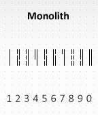 294
294Monolith C
FacesSummary: Minimalistic bars as numbers Readability: medium Examples: 04:36, 12:59, 18:25, 20:47 The Monolith display idea started with sketching for minimalistic numbers. I made these slim blocks with different lengths that form numbers in a new way. They look a bit like a barcode or some skyscraper lights. There are no horizontal elements but these numbers work just fine. Monolith is pure, simple, minimalistic, geeky and stylish as well. Design / Programming / Copyright © 2012, 2015 Sam Jerichow Thanks Nev Rawlins for your help!
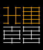
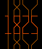
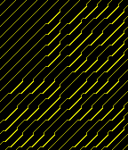 155
155Harigane Y
FacesSummary: Diagonal lines from the future. Readability: easy Examples: 04:36, 12:59, 18:25, 20:47 Harigane means wire in japanese. This watchface is inspired by circuitry. The "wires" run diagonally across the display and perform a sharp bend whenever they would pass a number. The actual numbers are invisible so you can only see them indirectly. Harigane has a stylish value for those who like lines, 45° hatches and circuits. Design / Programming / Copyright © 2015 Sam Jerichow Thanks to Nev Rawlins for his support!
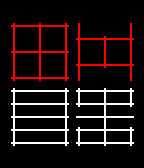
 16
16Pixel Intensity M
FacesSummary: Very low resolution numbers Readability: medium Examples: 04:36, 12:59, 18:25, 20:47 I like pixels so I developped a display, that shows time with low resolution numbers. Imagine the classic 7-segment numbers you know from LCD displays. In this watchface, they are pixelated to the max, until they are almost unrecognizeable. Almost. The result is a set of numbers made of 2x3 pixels which are still distinguishable by the position and the brightness of their pixels. The rule is: the more lines are in that area, the stronger the pixel. Low resolution doesn't mean low quality. There are pixels everywhere these days. It's a cool artistic way to describe reality. Design / Programming / Copyright © 2012, 2015 Sam Jerichow Thanks to Nev Rawlins for his support!
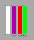
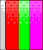 8
8Spectrum
FacesSummary: Color bars instead of numbers. Readability: hard Examples: 04:36, 12:59, 18:25, 20:47 Spectrum is a fun watchface with a scientific background. It started as binary idea. 1 = white and 0 = black. Once I had the basic shades for the basic numbers I thought, it would be interesting to give all the other numbers parts of the color spectrum. The cool thing is, the color spectrum can be divided into 8 distinguishable colors indeed! I'm using four long bars to tell the time. This is inspired by emission spectra of elements that get passed by light. The width of the bars increases by the usage of that digit. So basically, each number is a color. Sounds simple, but how do you learn which color belongs to which number? Make up a story. Red is love of two people. Orange three sounds like orange tree etc. The sillier the story, the easier to memorize. After a while you can read the watch faster while others just see wrist decoration. Check out the color reference chart in the preview section and... good luck! Design / Programming / Copyright © 2012, 2015 Sam Jerichow I thank Nev Rawlins for his support!