Fullscreen2
chops
Watchface
Description
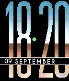
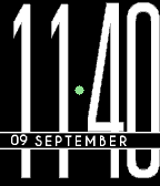
Another large number watchface.  It doesn't get much easier to read.

Here time on a classic pebble/steel is displayed with a different font versus on the PT/PTS.

On the classic it uses a square font to match the perfectly square screen,  while on a PT/PTS it uses a rounded font to match the rounded corners of the display.

You can also choose from a few styles in the settings.

The time separator has a few purposes - as battery indicator, charge indicator, and for bluetooth loss.

20 sept: updated bt icon
- Developerchops
- CategoryFaces
- PlatformsOG Pebble, Steel, Time/Time Steel, 2, 2 Duo, Time 2 (scaled)
- Updated2016-02-07
- Version1.2

